
%20copy.jpg)
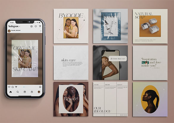
BYOODE SKINCARE
Brand Identity
Byoode Skincare is created using 100% natural and organic materials and components. They work with organic farms to source the highest quality ingredients, allowing the consumer to look flawless naturally. The name Byoode is a play on words for how you say Beauty, signifying the empathise on the brands ethos that everyone should feel beautiful within their skin.
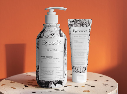
We set out to create an identity that was clean and sophisticated through elegant typography and a neutral colour palette that was inspired by nature. The packaging design is inspired by marble ink texture, like a bath bomb effect, that emphasises the careful blend of ingredients that goes into the products. We kept the marble prints black and white so that the design looked neutral while representing the blend of different natural ingredients.
BRANDING DISCIPLINES
Strategy
Identity
Logo
Advertising
Brochures
Signage
Leaflets & Flyers
Product design


%20copy.jpg)
%20copy.jpg)


